PLEASE ZOOM IN TO GET MORE DETAIL ON ANY TIME PERIOD.
Dear concerned citizen,
Thank you for your interest in actual facts about the budget. The chart below is a visual record
of the history of the federal deficit from the founding of the country right up to the present
day. The figures come directly from the federal government.
The numbers speak for themselves. The notes in text boxes in the left side are just further
explanations of how the chart actually works.
Of course, what the chart means can only be represented done from one's own point of view.
I confess to finding the accelerating scale and velocity of the downward plunge very disturbing.
But I've done my best, both in the labeling of contemporaneous events on the chart and in the
President-by-President commentary on the chart below it, to note only events that I find hard
to believe were merely coincidental, and to make the commentary, as much as I can, merely
descriptive of the actual change in the budget, in the context of just those events.
This is a work in progress. Suggestions for improvement welcome. Discussion page in the works.
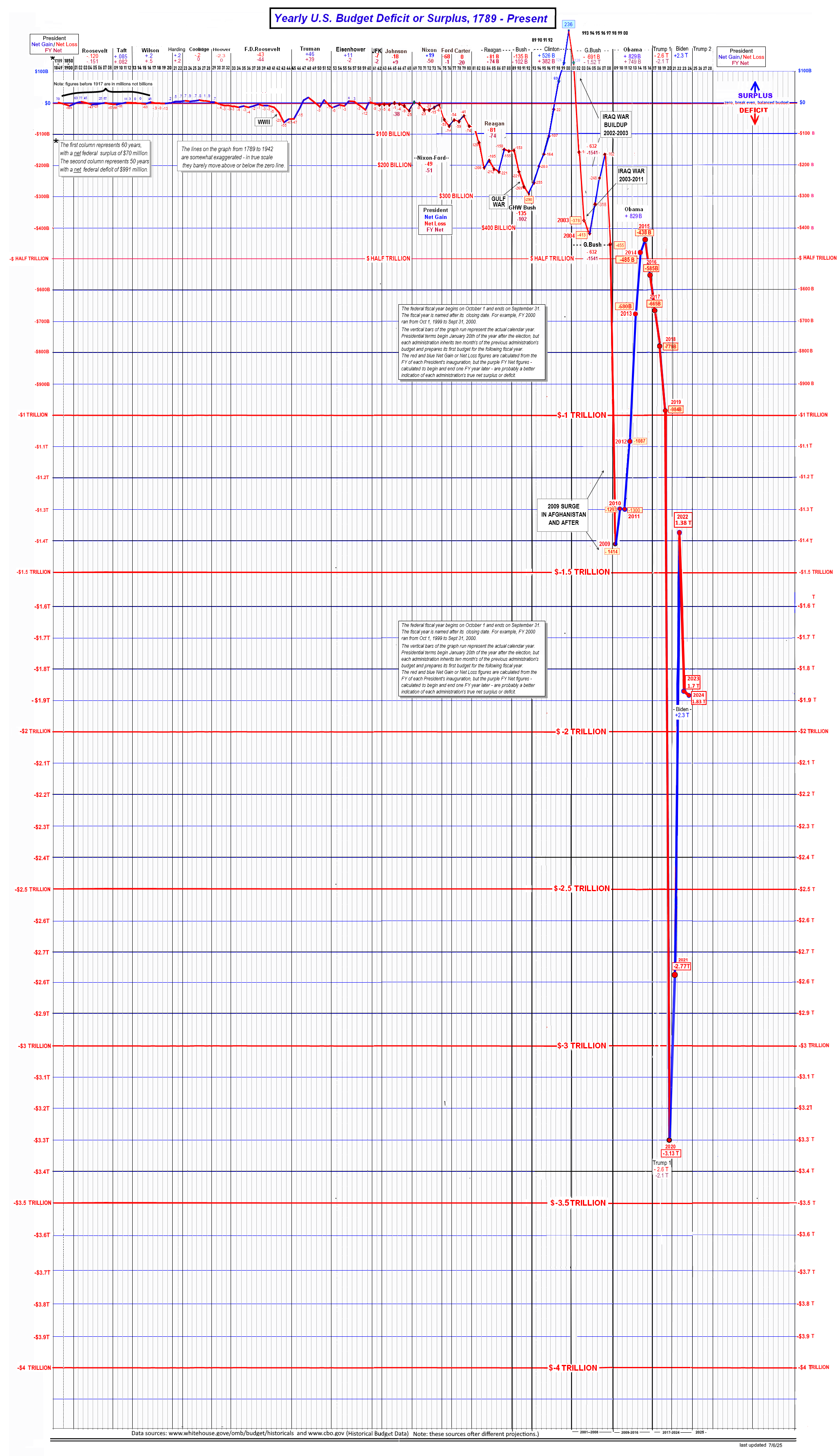
THE DEFICIT PLUNGE: WHAT EXACTLY HAS HAPPENED?
At first glance, it seems obvious that the -$3 trillion plunge in the deficit began after
the high point of Clinton's unprecedented +$238 billion surplus in 2001.
But a closer look at the chart reveals that the downward trend actually began in 1978,
in President Ford's first term in office. It continued This was the first time the federal deficit crossed the previous low point of -$55 billion,
set way back at the end of World War II.
The trend continued under Reagan. In 1982 it crossed the -$100B line; in
1983, it sank below the -$200B mark, and stayed there through 1985.
After a brief rise to the -$150B range from '86 thru '88, the deficit crashed again
during GHW Bush's Gulf War term - almost to the -$300B line in 1992.
Only then came Clinton's recovery: eight straight years of "the peace dividend," right up to that
record +$238B surplus.
But this was not the beginning of a new trend. It was a recovery that ended immediately after
Clinton left office.
And the angle and depth of the downward plunge begun under Ford in 1982 has only
gotten steeper and steeper.
In fact, I had to triple the downward dimension of the graph
in order to represent what has happened.
G.W. Bush, building up to the Iraq War, not only undid the entire recovery,
but went $100B deeper, to a new low of -$431B
- a total -$6B drop in just four years.
Bush's second term saw a three-year recovery to "only" -$1.62B in 2007.
But it dropped to a new low of -$455B in 2008, and Obama inherited a futher drop,
crossing the -$1 Trillion line for the first time, in 2009, to -$1.414T.
Then (as under Clinton) the trend shot up again - a $978B recovery, to -$438B. But it dropped again
to -$585B when Obama left office in 2016.
Trump called his first term "the "greatest economic recovery ever."
The facts and the numbers, however, tell a very different story.
It began with the 2017 tax cut of $1.47 Billion. Then, two years later, the Covid crisis,
with every taxpayer receiving a $2000 "economic stimulus" check - a total of $8.1 Billion.
But those together total only $10 Billion. They hardly explain the total net loss of
-$2.6 Trillion in Trump's first four years.
In fact, by the time Trump left the White House in 2020, the deficit had sunk
to a new historic low of -$3.13 Trillion.
Biden managed another $8B recovery to just under -$1.38T in 2022.
But by the time he left office in 2024 - with the US involvement in Gaza and Ukraine -
the deficit had dropped back down to -$1.83T. *
That's where the deficit stands now.
13 times deeper than Clinton's $236B recovery.
And 217 times deeper than the mere -$1.6B deficit when Nixon left office in 1974.
The most immediate question is, where will Trump take the deficit in his second term?
Unfortunately, there seems to be a good deal of evidence that his "Big Beautiful Bill"
will more than double the existing deficit plunge - to -$7 Trillion.
* NOTE: Please see the boxed note re: the effect of each previous administration's final budget on the incoming administration.
It's often difficult to judge exactly how much responsibility each administration bears as control of the economy
changes hands and the incoming administration inherits the budget of the outgoing one.
There are two figures below each president's name. The red figure calculates the net gain or loss in the defict from
ingaguration till last year in office - as one would normally expect. The purple figure, nowever,
extends the calculation to include the first year of the next president's term which is actually the last fiscal
year of the previous administration's budget. The real net effect oon the deficit is probably somewhere between the two numbers,
and it most cases it's not that significant, and usually decreases the amount of the change.
But including that next year nearly doubles the size of the deficit crash under the Bush administration budgets.